Packaging Design
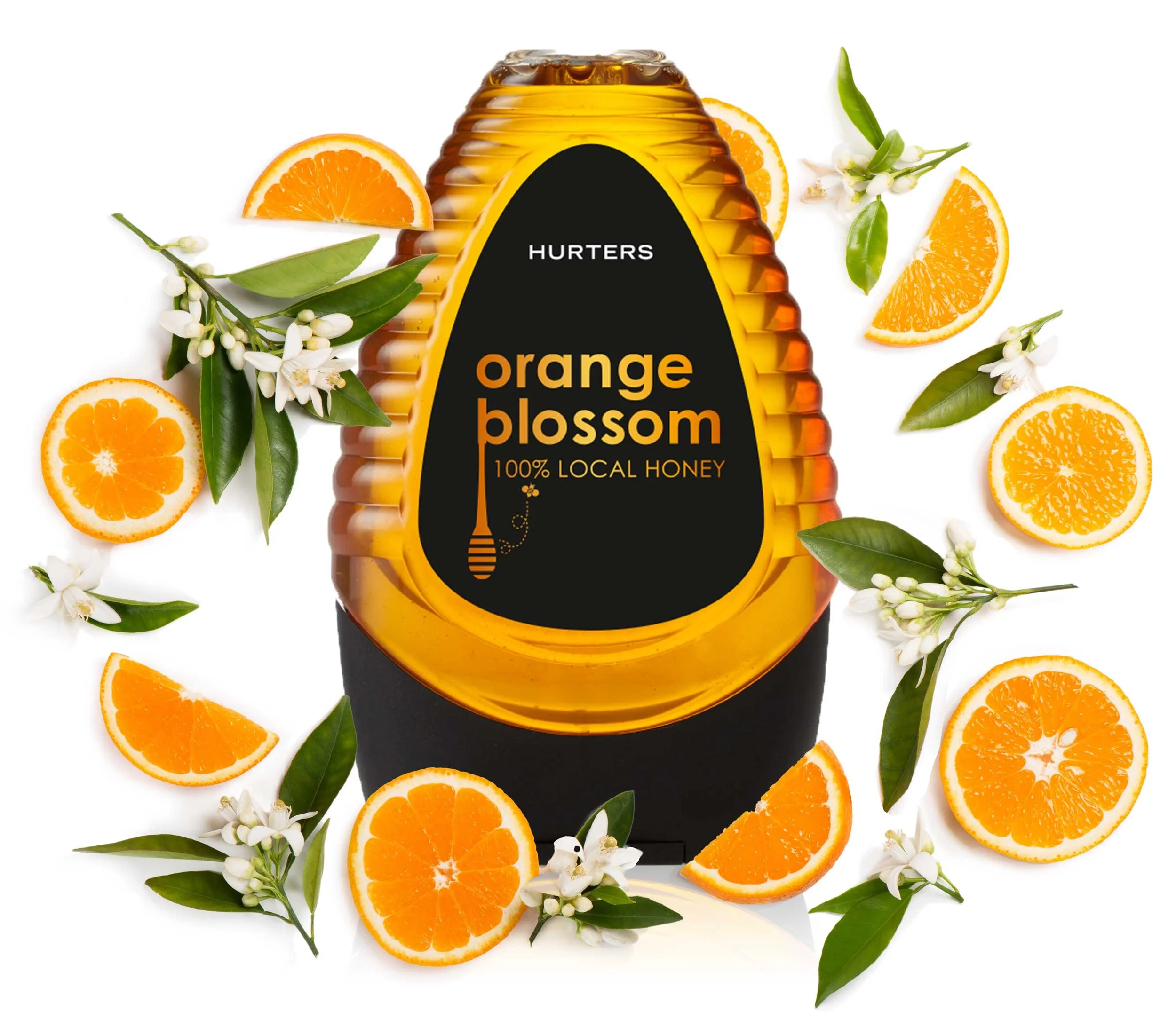
Hurters is a family run brand of honey harvested from beehives spread all over the diverse landscapes of South Africa, which has one of the most abundant ranges of flora and fauna in the world. This brief entailed creating a low-cost packaging design for their core products, as well as a more upmarket gift box.
I chose to use a black background to accentuate the rich golden colour of the honey within the bottle, as well as to complement the colour of the lid (which was predetermined). A lowercase sans-serif font was used along with a simple bee hive illustration, which gave the brand an approachable, friendly feel.


